Tuesday, March 1, 2011
Monday, February 21, 2011
Kyle Tezak » ISO50 Blog - Movie Concepts in Icon Form

These are slick. I know this has been done many times before, but this is done well. Bonus points for doing "The Great Gatsby" and "The Big Lebowski"
Tuesday, September 7, 2010
I changed my iTunes logo

Monday, September 6, 2010
Thursday, August 19, 2010
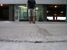
Eureka Carpark (Parking Garage) Melbourne by Axel Peemoeller

This is wicked. But It's wild to think about how he pulled it off painting these on?! Enjoy.
Friday, April 9, 2010
We Follow - Nice "Oops Page"

Thursday, April 8, 2010
What the iPad is Missing (No, it’s not a Camera) | The FontFeed

Typography took a back seat in the designing of Apple's famous iPad? Interesting. I'll take his word for it. It would still be nice to have an iPad though : )
A Showcase of Impressed Print Designs
Wednesday, April 7, 2010
Overcoming Creative Block | ISO50

This is a great post on overcoming creative block. 25 strategies from talented and successful creative professionals, all compiled in once place, to help overcome creative block. Sweet! Check it out. Definitely worth the read.
Create!
Saturday, April 3, 2010
Throwback Apple Concepts - ISO50

So wild throwback concepts that Apple was working on way back in the day. With the advent of the iPad and all the hype with it, it's neat to keep it all in perspective. It is always good to look back upon where we have come from. Love these.
Friday, April 2, 2010
IKEA Catalogue - So Addicting!

I love looking at the IKEA catalogues! It is so addicting. They way they help you imagine the spaces in your apartment or home is amazing. The minimalistic utilitarian design is so ... attractive. Oh man, just totally geeking out on form & function opportunities! It makes me want to sit down and sketch out my own line of minimalistic utilitarian furniture ... and learn Swedish.My wife and I are especially excited to look further into the countless possibilities & applications ...
IKEA Catalogue - So Addicting!

I love looking at the IKEA catalogues! It is so addicting. They way they help you imagine the spaces in your apartment or home is amazing. The minimalistic utilitarian design is so ... attractive. Oh man, just totally geeking out on form & function opportunities! It makes me want to sit down and sketch out my own line of minimalistic utilitarian furniture ... and learn Swedish.My wife and I are especially excited to look further into the countless possibilities & applications ...
Wednesday, March 31, 2010
MUJI Design - Minimalism, Simplicity, Utilitarianism

It's kind of like Ikea ... I dig it. They have lots of great products. Check them out. I first discovered Muji while in the MOMA store in NYC.
"What is MUJI?
MUJI is not a brand whose value rests in the frills and “extras” it adds to its products.
MUJI is simplicity - but a simplicity achieved through a complexity of thought and design.
MUJI’s streamlining is the result of the careful elimination and subtraction of gratuitous features and design unrelated to function.
MUJI, the brand, is rational, and free of agenda, doctrine, and “isms.” The MUJI concept derives from us continuously asking, “What is best from an individual’s point of view?”
MUJI aspires to modesty and plainness, the better to adapt and shape itself to the styles, preferences, and practices of as wide a group of people as possible. This is the single most important reason people embrace MUJI.
MUJI - in its deliberate pursuit of the pure and the ordinary - achieves the extraordinary."
The latest fonts from FontShop
Thursday, March 18, 2010
A Font Made from iPhone Apps
Wednesday, March 17, 2010
Website Design: Mega Drop-down Menus
Monday, January 18, 2010
Saturday, November 22, 2008
NTU Art & Design Book


......................................................................................................
This book was designed by Andrew Townsend for Nottingham Trent University and their Art & Design department. This is a nice piece of work. I love the custom design typeface on the cover, based on Avant Garde Bold, but adapted to have their individual textures. Sweet. This is an inspiring piece of work.
It includes multicolored sketching paper + stencils, and more. Sweet! I want one.


